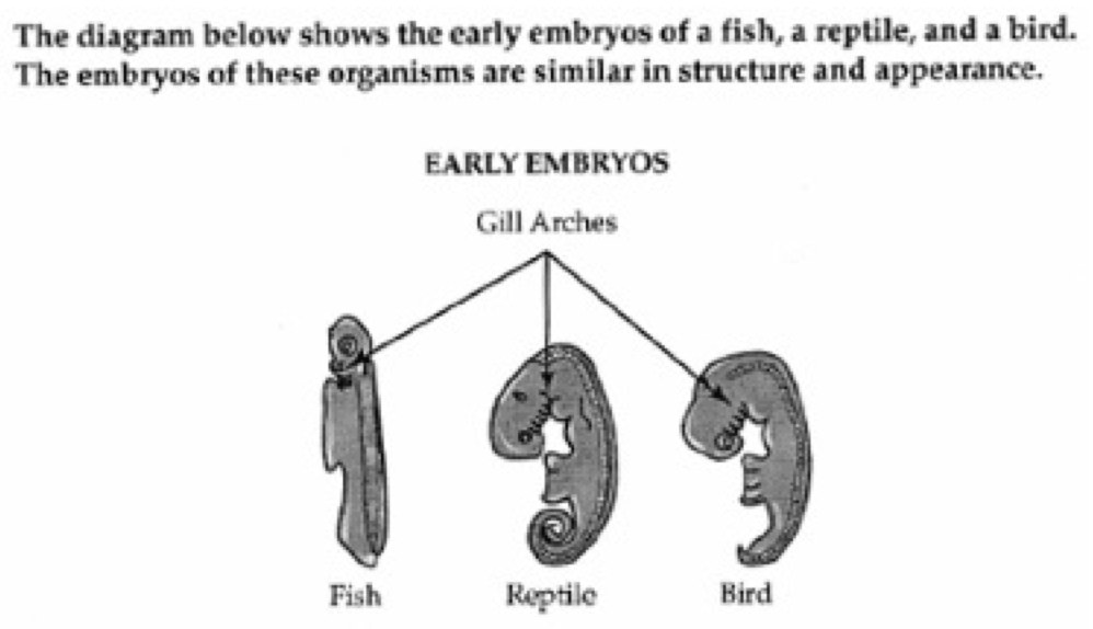
Note that all three embryo illustrations are shown in side view.
The fish embryo is long, narrow and straight. Its head is small, round, and contains gill arches. A large flap extends to the left, from just below the head to the middle of the embryo. A segmented bony structure runs the length of the embryo on the right.
The reptile embryo is much longer and fatter than the fish embryo, but is curled into a fetal position. Its head is bent forward and is twice as large as that of the fish embryo. The reptile embryo has twice as many gill arches as the fish embryo, but the flap on the left side is only half as long. A segmented bony structure runs the length of the embryo on the right.
The bird embryo is curved more than the fish embryo, but is not as long or as curved as the reptile embryo. The head of the bird embryo is almost as large as the reptile embryo, but has fewer gill arches. A flap the same size as that of the reptile embryo extends to the left. A segmented bony structure runs the length of the embryo on the right. Arrows point to the gill arches of all three embryos.
NAME |
FINCH |
BILL |
FOOD |
Vegetarian tree finch |
Tree finches |
Parrot-like bills |
Fruit eaters |
Large insectivorous tree finch |
Tree finches |
Grasping bills |
Insect eaters |
Small insectivorous tree finch |
Tree finches |
Grasping bills |
Insect eaters |
Woodpecker finch |
Tree finches |
Probing bills |
Insect eaters |
Warbler finch |
Warbler finch |
Probing bills |
Insect eaters |
Cactus ground finch |
Ground finches |
Probing bills |
Cactus eaters |
Sharp-beaked ground finch |
Ground finches |
Crushing bills |
Seed eaters |
Small ground finch |
Ground finches |
Crushing bills |
Seed eaters |
Medium ground finch |
Ground finches |
Crushing bills |
Seed eaters |
Large ground finch |
Ground finches |
Crushing bills |
Seed eaters |
The figure is a flow chart with eight labeled boxes linked by
arrows.
The chart is multi-directional. At each step, arrows point forward
to one or more boxes and back to the previous box or boxes.
Here the flow chart is described as lists in which the possible next
steps are listed beneath each box label.
The Krebs Cycle is depicted as a linear reaction which leads downward into a cyclical reaction. Here, the steps of the reactions are presented as lists.
Figure 1 is a bar graph that measures percentage of vaccination
coverage in five states over one year, from Q3 2006 to Q2 2007. In
each state, the coverage increases over time.
The data are summarized in the following table. All data are
approximate.
First dose rotavirus vaccination coverage among children aged 3 months, by quarter - immunization information system (IIS) sentinel sites, United States, 2006-2007. |
||||||
|
Arizona |
District of Columbia |
Michigan |
Minnesota |
Montana |
Oregon |
Q3 2006 |
35% |
10% |
5% |
0% |
15% |
20% |
Q4 2006 |
45% |
30% |
33% |
25% |
27% |
27% |
Q1 2007 |
50% |
45% |
42% |
35% |
37% |
45% |
Q2 2007 |
65% |
48% |
50% |
41% |
40% |
44% |
The figure is entitled "FOREIGN TRADE OF COUNTRY X, 1968 through
1980, in United States dollars". There are two lines on the graph, a
dashed line labeled "Exports" and a solid line labeled "Imports".
The vertical axis is labeled "Billions of Dollars," beginning with
zero to eighteen, in increments of 2. A note: one billion equals a
one followed by 9 zeros.
The horizontal axis is labeled "Year" and lists all the years from
1968 through 1980.
In the graph, the Exports line begins in 1968 at 3 billion dollars,
rises steeply to 14 billion in 1974, then drops to 9.5 billion in
1975 and 1976. In 1977, the Exports line shoots up to 15.5 billion,
then trails off to 10 billion in 1980.
In the graph, the Imports line begins in 1968 at 2 billion and rises
steadily to 8.75 billion in 1980, except for minor dips in 1972 and
1979.
The data are summarized in the following table. Figures are in
billions of dollars. All data are approximate.
FOREIGN TRADE OF COUNTRY X |
||
Year |
Exports |
Imports |
1968 |
3 |
2 |
1969 |
3 |
2.3 |
1970 |
4 |
2.4 |
1971 |
5 |
3.1 |
1972 |
10 |
2.5 |
1973 |
13 |
3.3 |
1974 |
14.2 |
3.7 |
1975 |
9.7 |
4 |
1976 |
9.5 |
5 |
1977 |
15.5 |
5.7 |
1978 |
12.5 |
7 |
1979 |
12 |
6.3 |
1980 |
10.2 |
8.6 |
The figure is a pie graph. The data can be shown in the following table.
Program Expenses | ||
Expense |
Dollar Amount |
% of Total |
Educational Initiatives |
$68,860 |
30% |
Personnel |
$63,868 |
28% |
Registry Operation and Enhancements |
$63,820 |
28% |
Registry Participation Initiatives |
$26,053 |
12% |
Program Supplies and Expenses |
$3,939 |
2% |